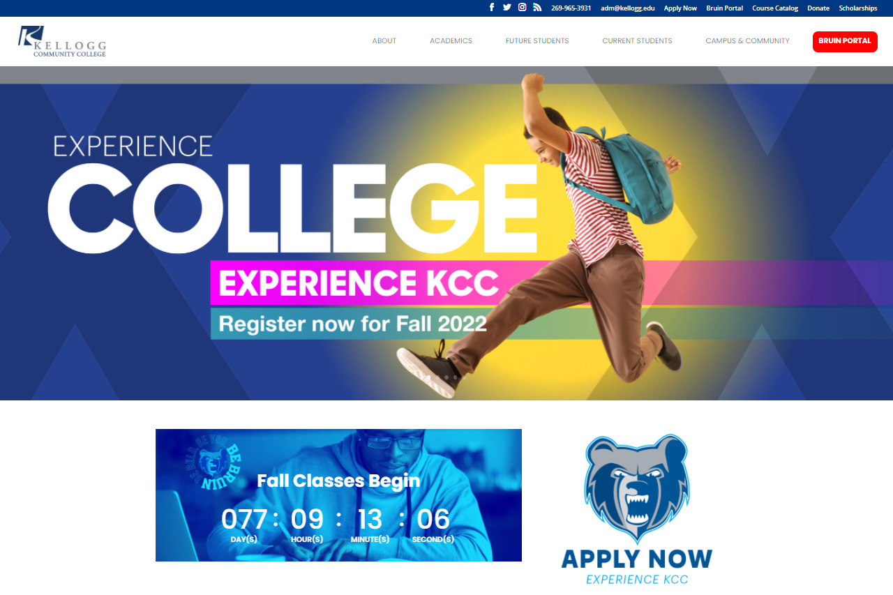
Kellogg Community College this week launched a brand new kellogg.edu website optimized to improve the user experience for new and current students.
The new website is the culmination of more than a year’s worth of planning and design work conducted by KCC’s Marketing and Communications and Information Research and Technology departments and is the first major KCC website redesign since 2014.
The site features a new crisp, modern design featuring black text on a white background, with customized, eye-catching and colorful interactive modules throughout the mobile-optimized design scheme.
KCC Media Design Manager Cab Rininger, who designed the site, said, “Our goal with the overall design was to simplify the content, increase accessibility and introduce fresh, bright colors to better reflect our vibrant student body and staff.”
Marketing Director Simon Thalmann said the new design is more user-friendly, intuitive and accessible than previous versions of the website, with data-informed content and navigation updates intentionally designed to serve the needs of student visitors.
“Kellogg Community College’s updated website will better connect new and current students to the information and services they need online,” Thalmann said. “The KCC website is more accessible and intuitive to use than ever before, making it easier than ever for new and current students to apply, register for classes or get connected with the resources they need via kellogg.edu.”
The new and improved kellogg.edu comes approximately one year after the launch of a new standalone KCC Athletics website – kelloggbruins.com – which was released last summer.
While the look and feel of the public website at kellogg.edu has been updated, other KCC online properties for students, including the Bruin Portal, Moodle, etc., and access to these services remains unchanged.
For more news about Kellogg Community College, view our latest press releases online at https://daily.kellogg.edu/category/news-releases.


